


Project Name:
Rebranding ET Telecom IPs
Project Introduction:
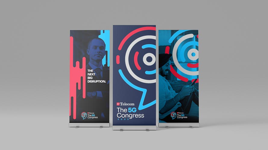
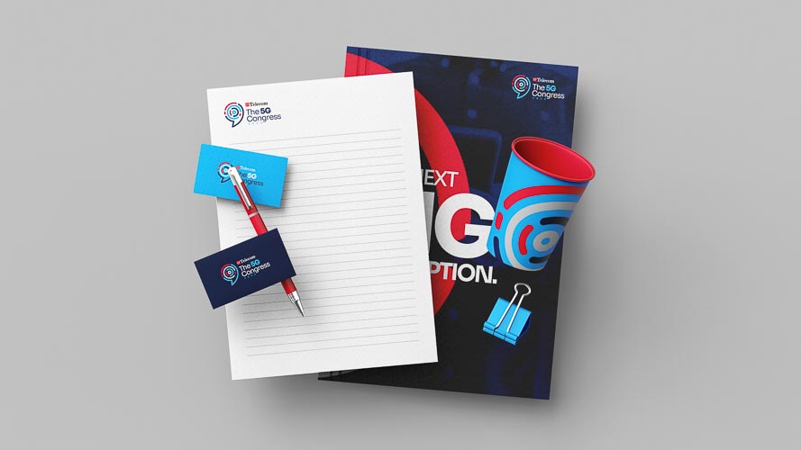
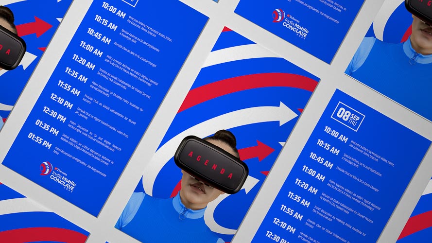
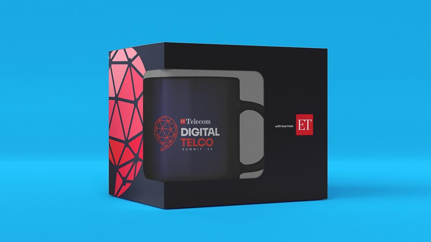
ET Telecom aims to dominate the telecom business space and become the largest, most trusted brand specializing in the telecom sector of India. We modelled a unique, functional, and consistent design system for the ET Telecom sub-brands and IPs as part of the same umbrella family, whilst giving them all an individual identity that is modern and powerful.
The branding signifies that no matter how much telecom evolves or how many technologies come up in the future, its core lies in communication. The visual language is timeless yet forward-looking. It combines communication with technology and brings all the IPs together under the parent brand i.e. ET Telecom. The branding is all-inclusive, cohesive, and easily recognisable. Each IP strengthens the overall brand image of ET Telecom in a clear, effective, and powerful way. All the visual elements including colours, typography, icons, and patterns are inspired by the functioning of these sub-brands and IPs, and the evolution of the telecom industry.
Client: ET Telecom Times Internet Ltd.
Designed by: Procreator Solutions